THick as thieves:
Brand IDENTITY
ROLE:
Creative Director
Design Director
Photographer
Small Business Owner
The phrase “thick as thieves” dates back to 18th-century England and describes two or more people who are extremely close, loyal, and often share secrets, suggesting a deep bond built on trust and mutual understanding. The more we explored its history, the more we appreciated its mysterious edge, rich storytelling roots, and playful hint of mischief. It was the perfect fit for a newly married couple who had just become thick as thieves in life, giving us a strong foundation to build a meaningful story around.
Designing a logo and visual identity for your own personal lifestyle brand is one of the most challenging and introspective creative tasks you can take on. It is a soul-searching process that goes far beyond aesthetics. When you are the brand and the brand is you, every decision becomes personal, pushing you to define who you are, what you stand for, and how to communicate that with clarity and purpose. At the heart of it all lies one of the most important questions: does it feel real? Reaching that truth requires depth, intention, and genuine creative honesty.
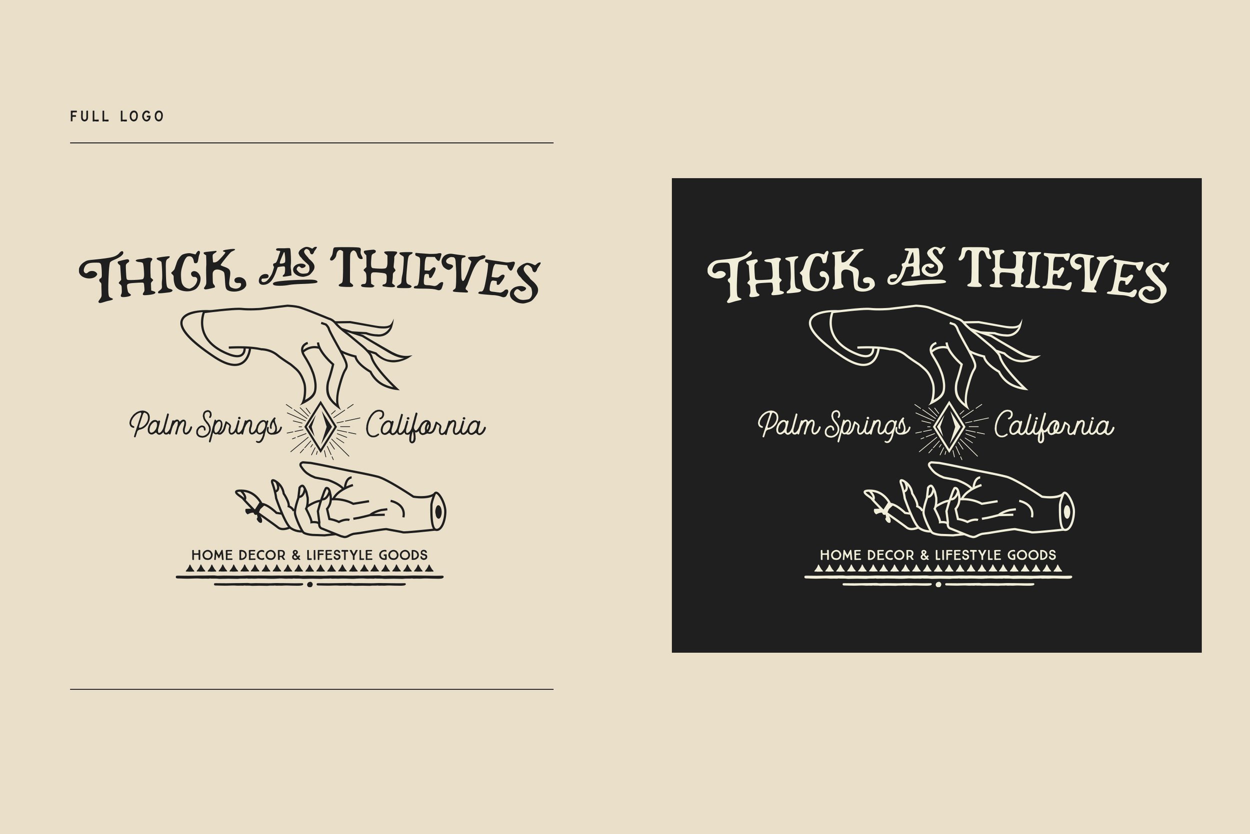
Our logo was thoughtfully developed to represent the brand and embody the essence of our purpose and positioning. The illustrated hands symbolize the personal, handmade, and skillful nature of our work, expressing authenticity, style, and character. They reflect our ongoing commitment to craft with intention and meaning in everything we create and carry. The diamond element introduces a sense of refinement, exclusivity, and lasting value, emphasizing the premium nature of what we offer. Together, the hands and diamond represent a shared vision, a spirit of co-creation, and the transformative process of making something meaningful together. The hand-drawn type and overall design reinforce a brand identity that feels honest and genuine, while communicating the idea that imperfection is beauty and should be celebrated.
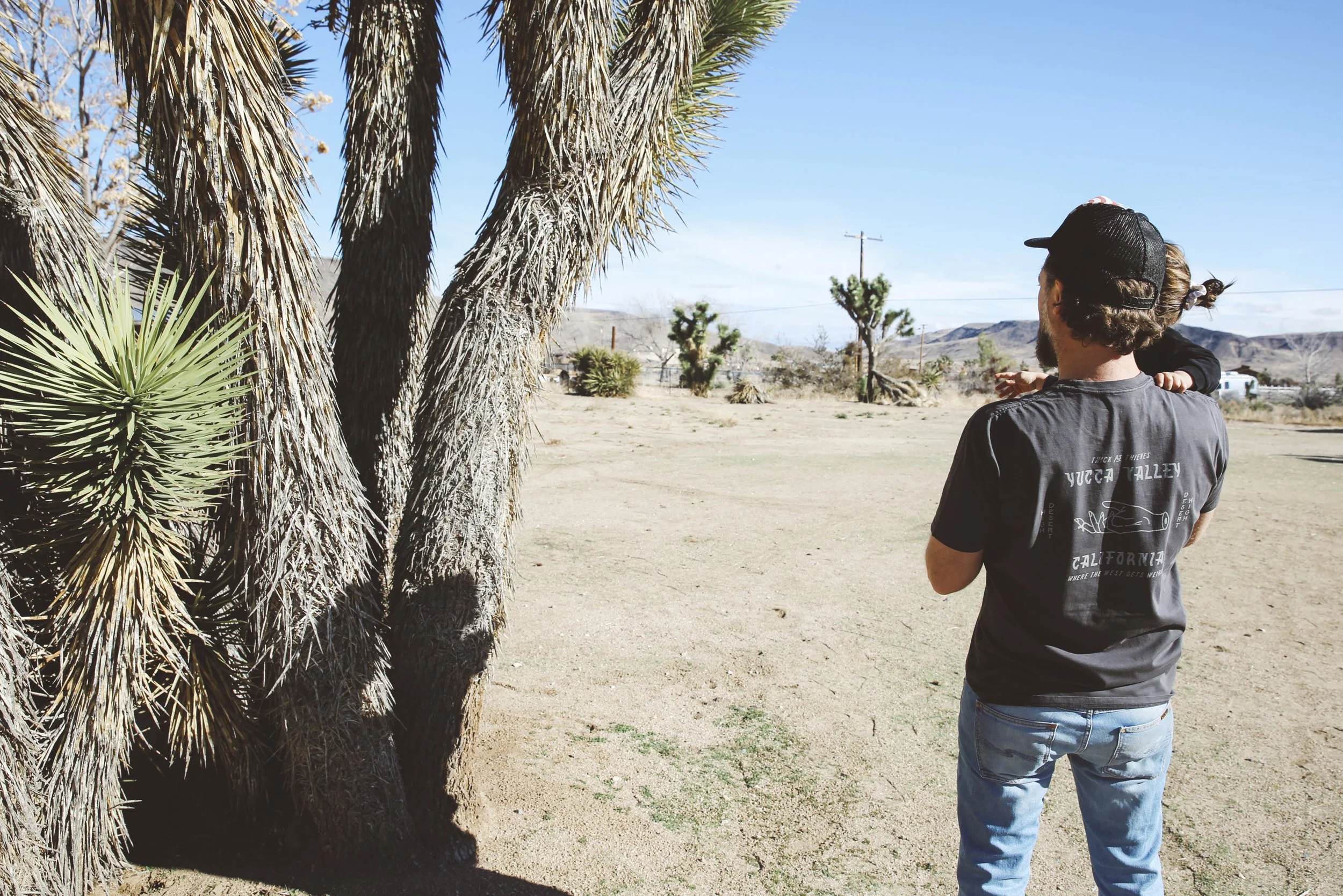
As we began shaping the rest of our visual library, it became clear that the inspiration we needed was all around us. Living in the desert offers a unique rhythm and perspective that deeply influences creativity and lifestyle. The vast open skies, dramatic sunsets, and quiet stillness create a sense of space and freedom that breathes life into our work. Our color palette, photography, and overall tone were all developed to reflect our physical environment. Palm Springs holds a unique place in our hearts, and we strive to represent its spirit with authenticity and respect.
Between 2021 and 2023, we grew the brand through three satellite stores that allowed us to explore new ideas in new places. We opened a scaled-down version of our flagship in Yucca Valley, along with two children’s stores in Palm Springs and San Francisco under the name “Little Thieves.” Each space introduced a creative adaptation of our original logo, carrying its own identity while remaining rooted in the Thick As Thieves brand. The same care, quality, and craftsmanship we started with came through in every detail. While we closed the doors on that chapter, the creative work lives on as we evolve and continue to push the brand further.