Rolling Rock
ROLE:
Senior Art Director
Package Designer
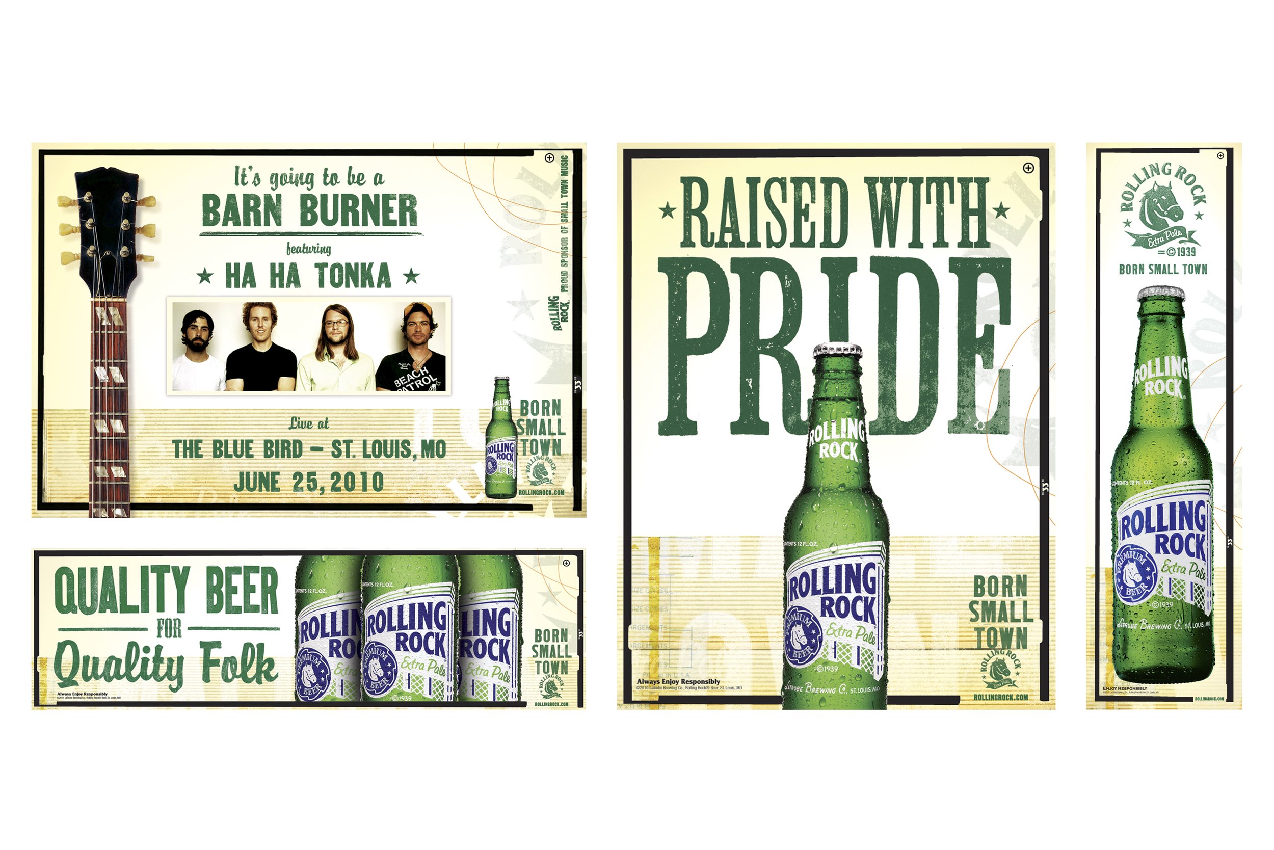
Rolling Rock’s Born Small Town campaign launched in the early 2010s as a strategic rebrand focused on reconnecting the beer with its small-town roots. The goal was to speak to a new generation of drinkers by highlighting the brand’s origin in Latrobe, Pennsylvania, with an emphasis on values like authenticity, craftsmanship, and a down-to-earth attitude.
Shortly after I joined the team, the Rolling Rock baton was passed my way to give the brand a little refresher. At the time, I was obsessed with finding, collecting, and photographing unique textures for my creative toolbox. It turned out to be the perfect fit for a brand rooted in small-town pride and built on true grit. The new look was given the green light (pun intended), and we rolled it out across the a variety of ads, promos, and brand POS.
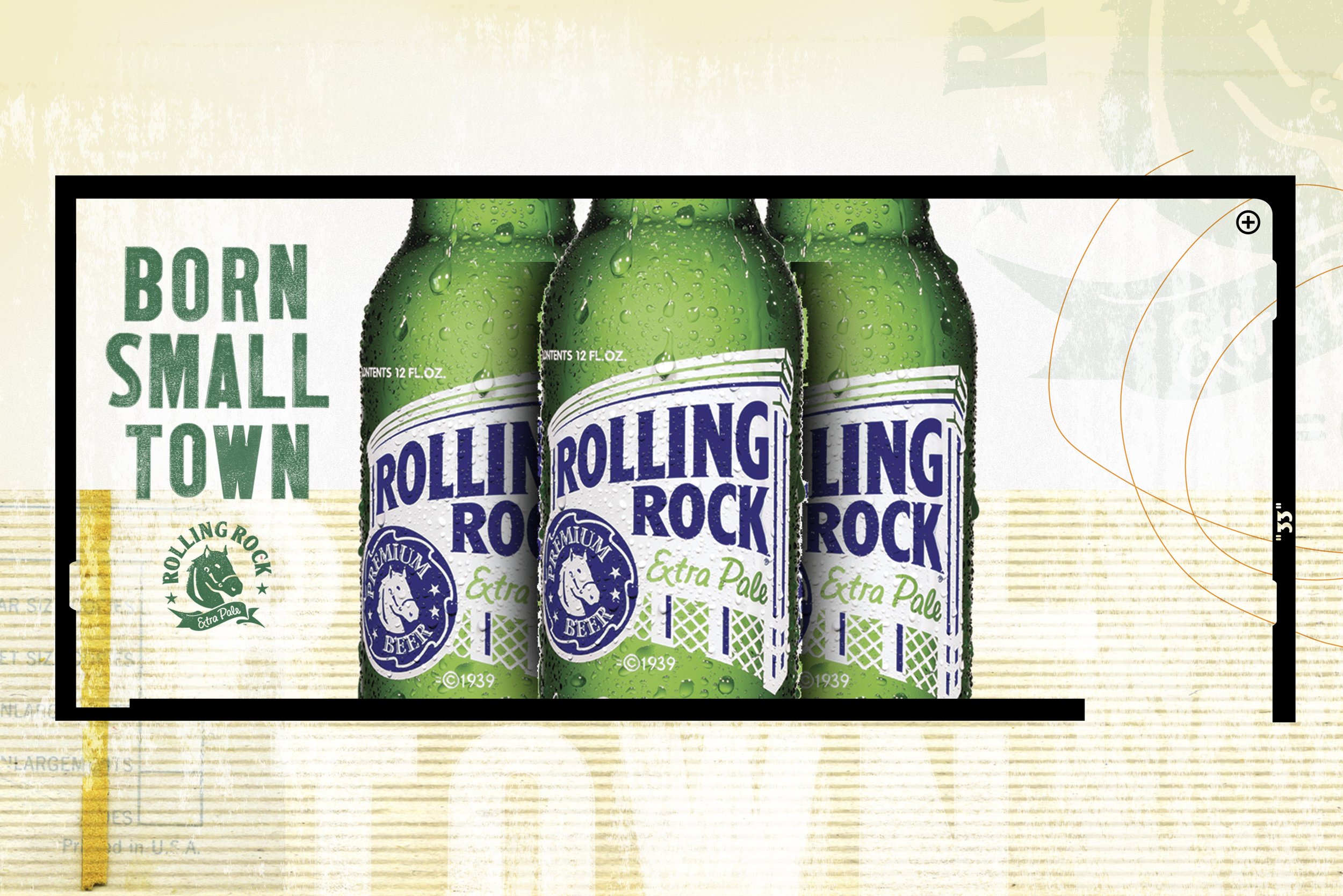
The following year, the focus shifted. Rolling Rock wanted to throw it back with a packaging update that felt both nostalgic and fresh. I drew inspiration from vintage beer can designs from the 60s and 70s, as well as from the brand’s own historical archive. With minimal changes from the client, the new primary and secondary packaging went into production and out to stores. The simplified look gave us something that stood out in the cooler and on the shelf. We supported the launch with cohesive point-of-sale materials to bring the full visual story together.
I think there’s only one thing left to say: “LET’S ROCK!”